Pets Canada
Re-Brand Design
Pets Canada (formerly PIJAC Canada) is a national, member-based nonprofit that advocates on behalf of the Canadian pet industry. After 35 years of championing pet health, business standards, and responsible pet ownership, they were ready to evolve. With their U.S. partner organization (The Pet Advocacy Network) undergoing a rebrand in 2022, it was the perfect time for a visual and strategic refresh to match.
The team explored new naming directions, ultimately choosing Pets Canada – a name that’s clear, memorable, and inclusive of all species, businesses, and pet lovers across the country. They needed a rebrand that could reflect their legacy, speak to modern audiences, and unify a wide variety of stakeholders.
As lead designer on the project, I was responsible for shaping the new visual identity and rolling it out across digital and print platforms – tying it all together with a special 35th anniversary logo to celebrate the milestone.


The
Ask
This wasn’t just a facelift – it was a full transformation. Pets Canada needed a brand identity that:
-
Reflected their inclusive values and represented all pet types (not just cats and dogs)
-
Felt modern, caring, and distinctly Canadian
Worked seamlessly across a wide range of platforms and audiences -
Included a celebratory anniversary logo for year-long recognition
-
Could be scaled into a full collateral rollout: from trade show booths to social graphics to printed brochures
The logo had to be strong enough to stand alone, flexible enough for many uses, and warm enough to resonate with everyone from policy makers to pet lovers.

The
Process
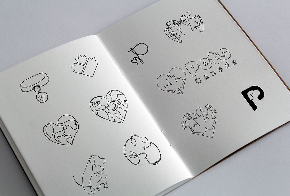
We started by exploring a range of early logo concepts: paw prints, pet collars, animal silhouettes, and stylized maple leaves. While many were visually compelling, they didn’t quite capture the full spectrum of what Pets Canada represents.
We pivoted toward a symbol that could hold deeper meaning. The final logo is a heart shape divided into three sections by a soft, rounded maple leaf cutout – symbolizing care, unity, and Canadian values. It avoids being species-specific while still evoking a sense of love and responsibility for all animals.


The visual identity builds on approachable yet trustworthy typography, pairing the rounded boldness of Hoss Round Heavy for headings with the clarity of Lato for supporting copy. The colour palette was carefully chosen to strike a balance between warmth and trustworthiness: deep navy and vibrant orange provide contrast and boldness, while soft greens and blues lend calm and trust. Accents like lavender, cyan, and lime green add flexibility for seasonal or campaign-based content.
To complement the logo and colours, I designed a library of graphic elements – including line-drawn animal silhouettes and scale-like patterns – that could be used interchangeably across print and digital assets. These elements added personality while maintaining visual cohesion.
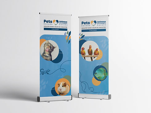
Once the core brand was established, I led the rollout across all touchpoints: redesigning the website layout, developing event collateral (banners, booths, posters), creating educational and outreach materials, and building a ready-to-use social media toolkit. I also designed a one-pager and multi-panel brochure to support industry engagement.
For the 35th anniversary mark, I animated a celebratory logo reveal video – used in event presentations and online to bridge their history and future.

Tools & Techniques
Sketchbook + Adobe Illustrator: concept development, logo creation, vector systems
Adobe Photoshop: mockups and
photo-based visual
Adobe InDesign: print materials, layout design, and templated assets
Adobe After Effects: animated logo reveal for anniversary launch
The Results
The Pets Canada rebrand launched to strong positive response – both from within the industry and the public. The identity balances warmth and professionalism, aligning with their values while elevating their visual presence.
The new look rolled out across national event appearances, digital platforms, and member communications. The heart-shaped logo is instantly recognizable, and the extended brand system gave Pets Canada the flexibility they needed to evolve while remaining cohesive.
More than just a new logo, this identity signaled a recommitment to advocacy, animal welfare, and community-driven leadership.
Personally, this was one of the most creatively fulfilling projects I’ve led. It challenged me to design something meaningful, scalable, and emotionally resonant for a complex, beloved industry – and it’s a piece I’m proud to carry forward.
If you’d like to learn more about the incredible work Pets Canada is doing, you can visit their website.


“As the pet industry has evolved, so have we. This new chapter under the Pets Canada name reflects our continued dedication to responsible pet ownership, sustainable growth, and our members across the country. The rebrand isn’t just a new look—it’s a renewed promise to champion the wellbeing of animals and the businesses that care for them.”
— From the Pets Canada Rebrand Announcement


