
CONECTed
Report Branding & Layout, Logo Design, Presentation Template
CONECTed – before they transition to ACTION – is a powerhouse in the Canadian oncology space. They were ready to showcase their hard work with Getting Better, Faster, a business case report highlighting their efforts to improve cancer care in Canada.
The report itself presented dense, content-heavy material, so the branding needed to support clarity and engagement. The ask was to create a visual identity that reflected the report’s innovation, while staying aligned with CONECTed’s existing look and feel. The result needed to feel polished, easy to digest, and cohesive from cover to cover.


The
Ask
The client was looking for a custom branding package tailored to the business report. This included:
-
A custom logo specific to the report
-
A full visual identity system with brand colours, typography, patterns, and supporting graphic elements
-
A modular layout system for the full report design
-
A photo library curated to match the tone of the report
-
A PowerPoint template to complement the final report for future use
They wanted a visual story that felt sharp and innovative, tied into their values and easily adaptable across mediums. The tone had to balance professionalism with warmth – clear enough to guide the reader, strong enough to make an impact.


The
Process


The initial pitch deck included some research to create a moodboard with a general brand direction, and two options of report cover concepts to build off of. With feedback from our discovery meetings, I expanded the moodboard, logo ideas, and visual direction by incorporating the client’s references and feedback. I researched deeper into oncology, medical innovation, and storytelling to create something strategic and meaningful.
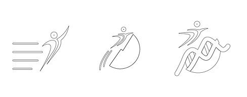
The visual identity grew from early sketches and symbolic exploration, initial ideas played with beakers, graphs, and mountain-like forms. Through collaboration, we refined the concept into a DNA strand forming a mountain, with a human figure climbing upward that looks similar to a cell formation. This evolved into a distinctive logo that reflects progress, growth, and transformation.

The visual identity grew from early sketches and symbolic exploration, initial ideas played with beakers, graphs, and mountain-like forms. Through collaboration, we refined the concept into a DNA strand forming a mountain, with a human figure climbing upward that looks similar to a cell formation. This evolved into a distinctive logo that reflects progress, growth, and transformation.
Tools & Techniques
Hand sketching for creative exploration of logo concepts and wireframes
Adobe Illustrator & Photoshop for visual development
Adobe InDesign for layout, branded styles, and formatting consistency
The Results
This project was both creatively fulfilling and strategically aligned – and the final materials were incredibly well received. The board selected the final logo unanimously, noting how well it captured both scientific innovation and human impact.
The final report, titled Getting Better, Faster: The Case for Optimizing Access to Precision Medicine in the Wake of the Revolution in Cancer Care, was co-authored by Louise Binder and Ethan Pigott. It’s a comprehensive piece outlining the evolution of precision medicine, the barriers patients still face in accessing innovative treatments, and key recommendations for change. The report was designed to support high-level advocacy, and the visuals needed to match its weight.
After launch, the CONECTed team hosted a two-day national webinar series, bringing together advocates, patient groups, and medical professionals to explore the report’s findings and discuss the future of personalized cancer care in Canada. The branding I developed extended seamlessly into these presentations and outreach materials.
The final brand identity and layout system were rolled out in both English and French, extending across the report, presentation decks, and speaker invitations. It’s clean, engaging, and confidently showcases CONECTed’s (now ACTION’s) leadership in shaping the future of oncology care.
This project reflects what's possible when thoughtful design meets powerful storytelling. It’s a piece I’m truly proud to have in my portfolio.


