
SJ. Studios

Visual Identity
SJ Studios is a brand experience and creative agency led by Simi J. Famuyiwa. The studio blends branding, marketing, events, creative production, and writing. It's also closely tied to Simi’s personal brand, which shares the same name: SJ.
That overlap is where the challenge came in. Simi wanted a logo that could work for both her agency and her content creation, something that felt cohesive across platforms but also allowed for a bit of personality to shine through. She described her brand as fun, safe and out-of-the-box, and was after something confident, clean, and creative.

The
Ask
We knew we were heading into monogram or wordmark territory, something clean and modern that wouldn’t clash with the variety of brands she works with. She was clear about avoiding heavy icons and strong solid colours, instead leaning toward a more abstract, softer, more neutral aesthetic that could work anywhere.
The project needed to deliver:
-
A visual identity system that could flex between the agency and her personal content brand
-
A simple, stylized monogram that felt confident, professional, and a little playful
-
Logo variations for digital, social, and print
-
Font and colour recommendations for consistent use

The
Process
This project was a delightful blend of strategic structure and creative flow, generously infused with collaborative energy, thoughtful direction, and exciting exploration!
Our process began with Simi sharing her vision and inspiration, including a curated Pinterest board. A subtle but deeply meaningful detail she shared was the meaning of her name, 'Simi,' which means 'rest.' From the very beginning, she expressed wanting the logo to feel 'safe,' 'fun,' 'whole,' and uniquely 'unexpected' – something truly 'out of the box' yet grounded and reliable. Given that SJ Studios works with such a diverse range of brands, my strategic approach ensured the visual identity would be neutral and flexible enough to blend effortlessly, never clashing.

We began exploring more abstract monogram concepts, and through our initial collaborative discussions, Simi gravitated toward a sleeker, more compact treatment. This crucial feedback allowed me to strategically guide the direction, shifting our focus to explore positioning the "S" and "J" letters side-by-side rather than stacked. This pivot was key to discovering the monogram's unique, modern feel while offering clearer letter definition and a cleaner, more linear layout. Simultaneously, Simi was immediately drawn to a serene, light beige-toned palette, and we worked to maintain that calming, neutral range while introducing contrast.
Through this collaborative effort, we landed on a clean SJ monogram that had just the right amount of boldness – perfectly balancing her creative energy with the essential versatility needed for a brand that confidently operates in multiple spaces. This was a moment where my strategic insight truly empowered the design!
Tools & Techniques
Hand sketching to explore initial typographic forms and compositions
Adobe Illustrator for logo refinement and final vector exports
Adobe Photoshop for mockups and visuals
The Results
The final visual identity for SJ Studios is clean, modern, and full of quiet confidence. The custom SJ monogram strikes a thoughtful balance, bold enough to feel distinctive, yet adaptable across brand touchpoints. It’s designed to flex between Simi’s creative agency and her personal content brand, creating cohesion without blending the two into one.
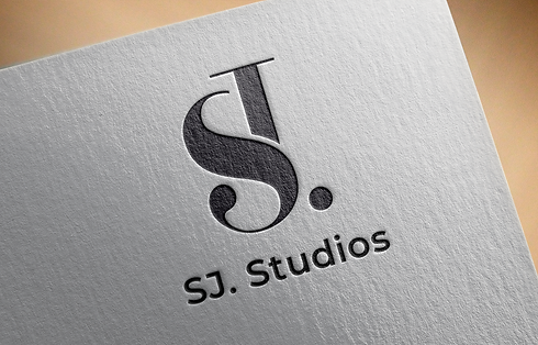
The logo icon itself is a stylized interpretation of her initials: the “S” forms the core of the mark, with the “J” subtly emerging from the lower curve. A serif-inspired top stroke curves outward from the “J,” adding just enough contrast and sophistication while maintaining a minimal, unified form. The structure is intentional and refined, visually clear, modern, and recognizable.
The font pairing consisted of Montserrat Bold for its clean, geometric strength in headings and primary brand marks, with Source Sans for body text, a highly readable, neutral sans serif that balances personality with clarity. Together, the typography creates a contemporary tone that feels grounded and polished.
The final palette leans into soft, beige-based neutrals with a deep charcoal accent, inspired by the meaning behind “Simi” (rest) and the calming, grounded tone she brings to her work. The colour system and typography work in tandem to build a brand presence that’s both structured and serene, ideal for a studio that blends strategy, storytelling, and creative direction.
With a suite of logo variations, a flexible design system, and brand assets that feel versatile but adaptable, Simi has a cohesive identity she can confidently carry across social media, events, client work, and beyond.


